Nat Geo uses a pictorial calendar for ebola visualization
National Geographic sure knows the power of good visuals. Their ebola tracking report has one particularly neat yet unusual view: a graphical calendar of 2014, one map per week.
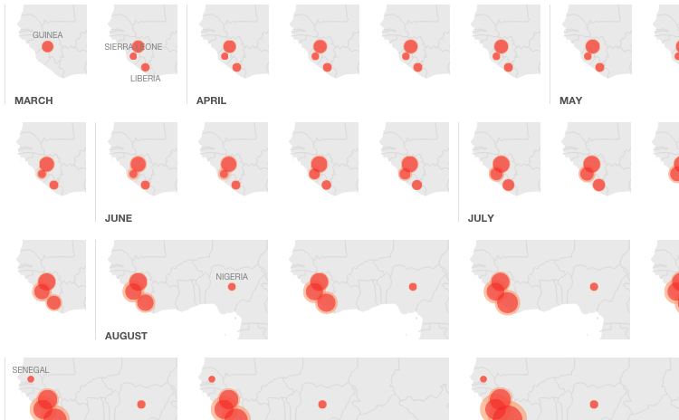
National Geographic sure knows the power of good visuals. Their ebola tracking report has one particularly neat yet unusual view: a graphical calendar of 2014, one map per week.